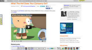
Ever notice those websites that have “Feedback” in sideways text on the web, driven far and wide by GetSatisfaction? I hate those buttons. They completely ruin the aesthetic that site designers struggle to bring to their web pages, by forcing my eyes to this giant block of text.
That was just the start, apparently. Other sites now are taking it to the next level. They layer increasingly complex Javascript-loaded toolbars onto the page, forcing your laptop’s fan on and bringing scrolling and navigation to a crawl.
The worst I have seen in a while is this site by Brad Feld, a venture capitalist with a fairly popular blog.
I get it – he probably invested in Highlighter and wants to eat his own dog food. But, my god, it makes his page (which is already overly complicated) look like a pile of dog food. Outside of the brilliant XtraNormal video, I’m incredibly confused about where to look next. In fact, the little Highlighter boxes to the top, left and right all faded in after the page loaded and when I moved my mouse, further distracting me from the true content on the page.
Where have all the clean, fast-loading, simple websites gone? Why are they being replaced by battery-chewing, fan-inducing, slow-moving piles of garbage? And, most infuriatingly, why does the “Feedback” or “Highlighter” text have to be sideways?


didn’t you put a side box on neuros.tv 🙂
I reserve the right to change my mind over time!