Skip to primary content
Skip to secondary content

Jason Shah

Jason Shah

Main menu

  • Home

Monthly Archives: July 2010

Microsoft Office default pie chart

Posted on July 29, 2010 by Jason Shah
4

When you create a pie chart in MS Office 2007, the default data creates a chart that looks like this.
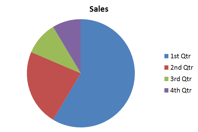
If your sales chart actually looked like this, you should be fired.

Posted in business, funny | 4 Replies

I am building products and also looking to acquire a software company.

Active projects:

  • RevenueRegister
  • Spelling Test Buddy
  • Worksheet Creator
  • Vocab Word Study (iOS)
  • Extra Math
  • Free Spelling Games
  • Dentrix Report Converter
  • SwipeWhite by Forever Dental
  • Dictionary.dental
  • Practice Observer
  • Practice Checklists
  • Patient Agreements
  • Chicago Police Report

Previously, I was the CTO of Mediafly, where I led product and engineering for 14 years, to over 100 team members. I'm a former management consultant with Bain, Chicago Booth MBA and have an MS in Computer Science from UIUC.

Outside of work, I enjoy power lifting and am a 4-season bike commuter (current PR is -20°F). Oh, and I help my wife run her dental practices.

LinkedIn | X/Twitter

Proudly powered by WordPress